
Supergrass
Date: Jun 2012
Category: Advertising, Branding
During spring 2012, Supergrass Festival promoters asked RUNBVS, a designers collective I was part of at the time, to take care of their brand design.
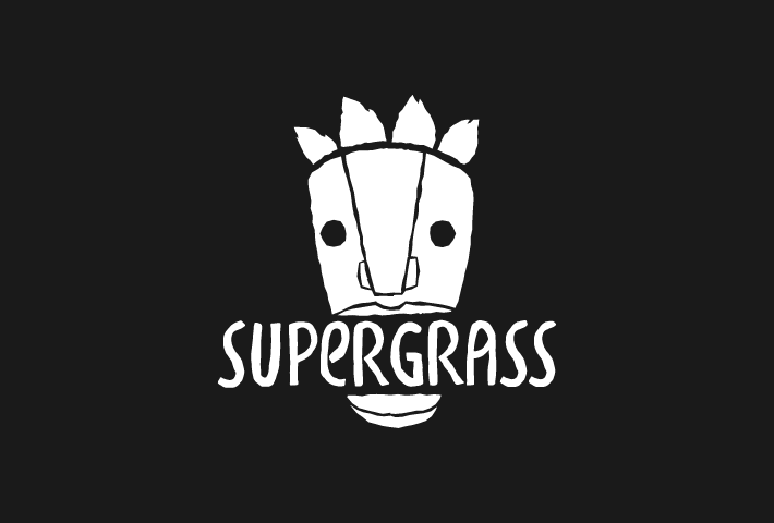
The main concept was that Supergrass had to be a “safe zone” where people could go spend some time far from the desolation of the city during the summer, with friends and good music, so we thought that the logo should have been something that would help everyone inside the festival area to identify as part of a big family: after some research we decided that a tribal mask would be an interesting choice. Based on a large number of sketches, we synthesized the basic vector image of the final logo, which was completed using a procedural dirty brush, to give it a gritty feeling.
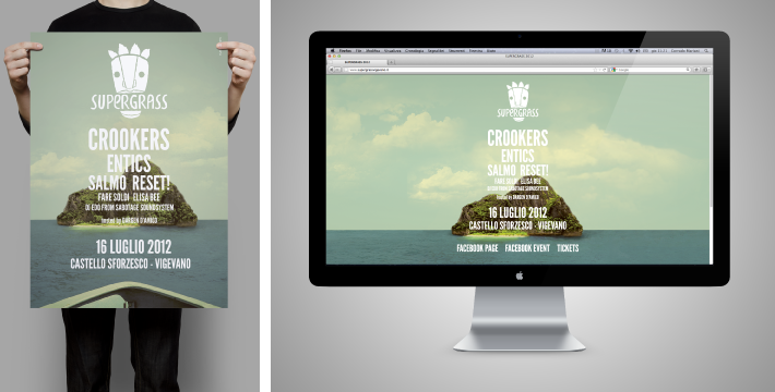
We then realized the poster and the miniwebsite of the event, using a self-created matte painted island as the backgraund, which was meant to symbolize the “safe zone” of our branding concept, giving also a “summer looking” feel to the composition.
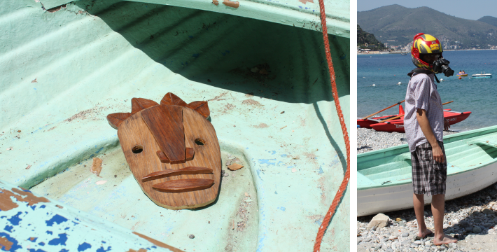
But the most funny and interesting part was undoubtedly the teaser video realization: we built a real wooden mask, a first person view camera helmet and then we moved to the sea to shoot the whole footage.
© 2013 🚀 2024
crdmrn ≈ corrado mariani