Roller Macherio
Date: Sep 2014
Category: Branding, Logo Design
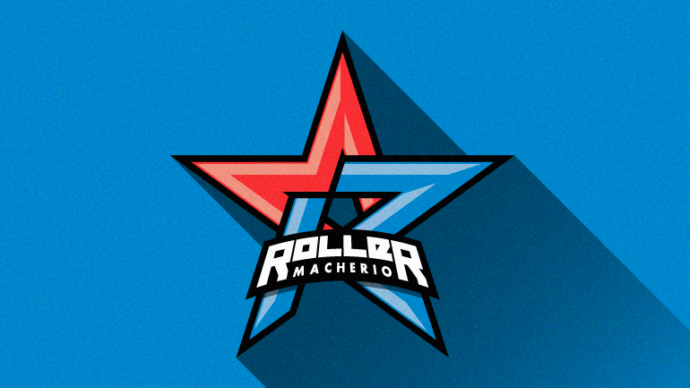
After I moved to Germany, the rollerblading team I used to skate with when living in Milan was absorbed by another one, called Roller Macherio, from a nearby town. This event gave the team a chance to renew its (pretty amateur) branding. Given my Graphic Design studies, I took the chance to show my support for my teammates and redesign the team logo and uniforms.
As the first step of the process, I analyzed the two previous “logos” (ahem…) of both teams to extrapolate their basic shapes. Then I tried to merge them to create a shape both simple and detailed.
The final result resembles american logos of NBA/NHL teams, from which I took inspiration, while keeping the original colors of the team and some geometrical elements of the old ones.
After that, I proceeded with training and competition uniforms design: for the first ones, I decided to keep a single color background and print for the athletes and a colored logo on a blank t-shirt for coaches; while for the competition uniform I worked on a pattern inspired by the logo itself.
Years after, it’s still great to see my old teammates wear the designs I made for them. Even if the occasions to meet are very rare.
© 2013 🚀 2024
crdmrn ≈ corrado mariani